
SWIMMING IN COLOR
Brand Identity
Ideation | Design | Art Direction | Layout
Brand Identity
Ideation | Design | Art Direction | Layout
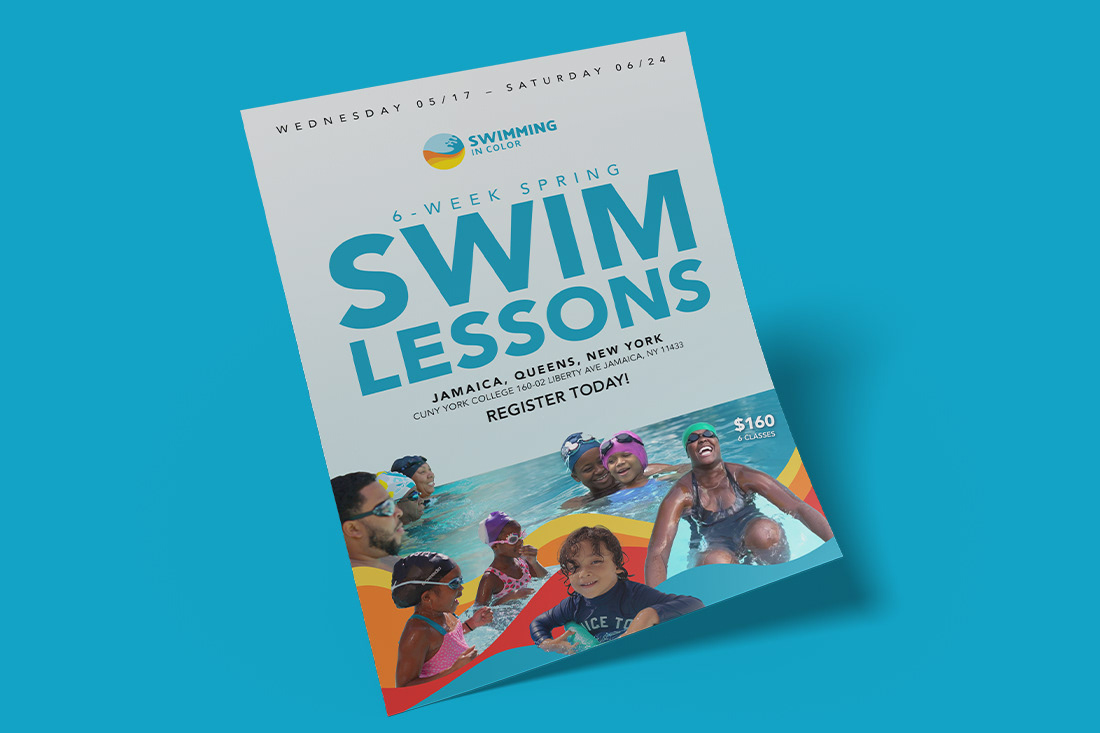
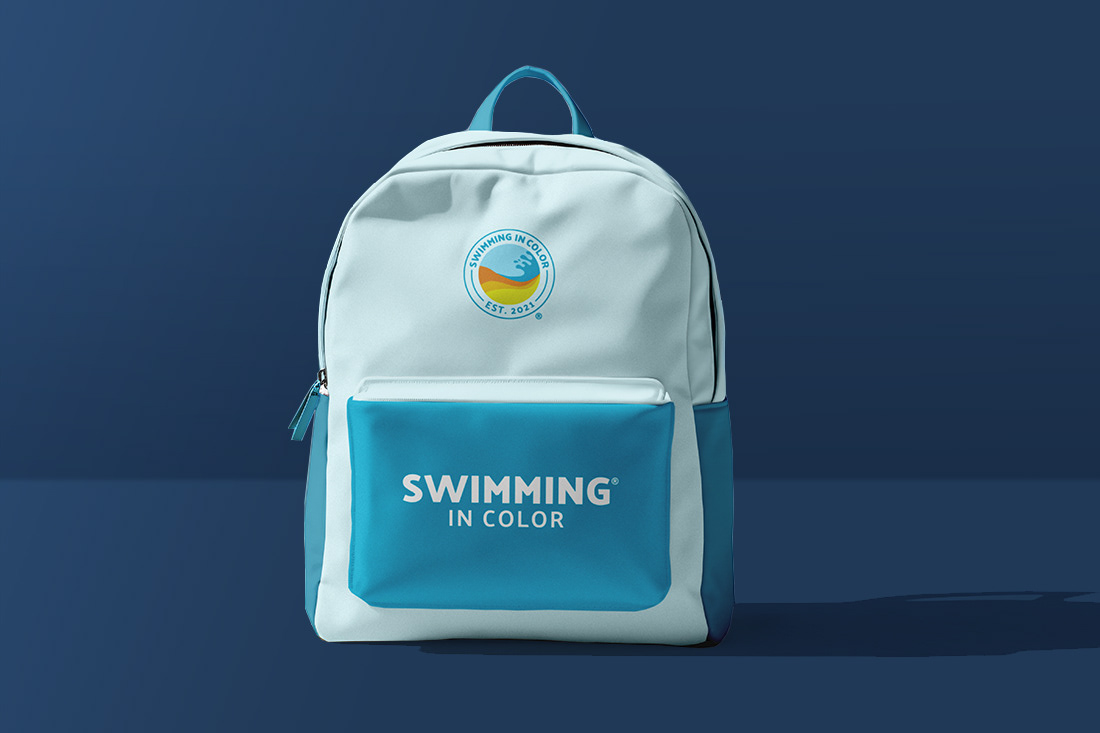
Purpose: To create a fun and playful brand identity for Swimming In Color a mission-driven company created to liberate people of color through learning how to swim.
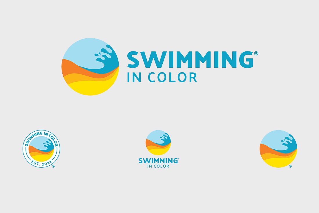
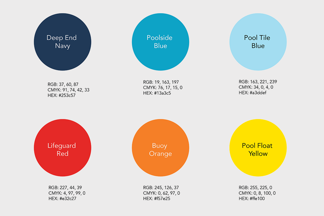
Concept: Inspired by the organization "Swimming in Color," I created a simple circular motif featuring colorful waves. The waves and circle symbolize the organic essence of swimming, while the vibrant colors reflect their inclusive approach to fostering a diverse community of swimmers.
Concept: Inspired by the organization "Swimming in Color," I created a simple circular motif featuring colorful waves. The waves and circle symbolize the organic essence of swimming, while the vibrant colors reflect their inclusive approach to fostering a diverse community of swimmers.
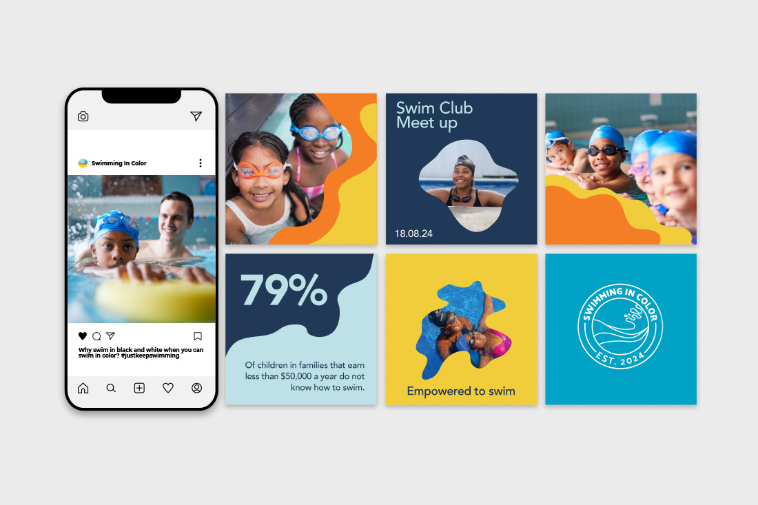
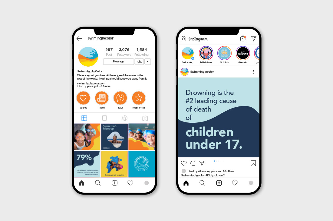
Tactics: Logo, social media templates, flyer, and backpack.


FALKON TECHNOLOGIES
Environmental Branding
Ideation | Design | Art Direction | Layout
Environmental Branding
Ideation | Design | Art Direction | Layout
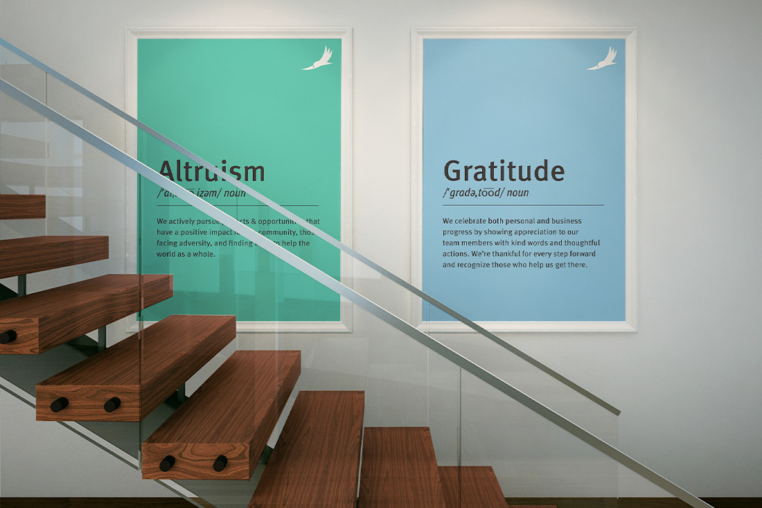
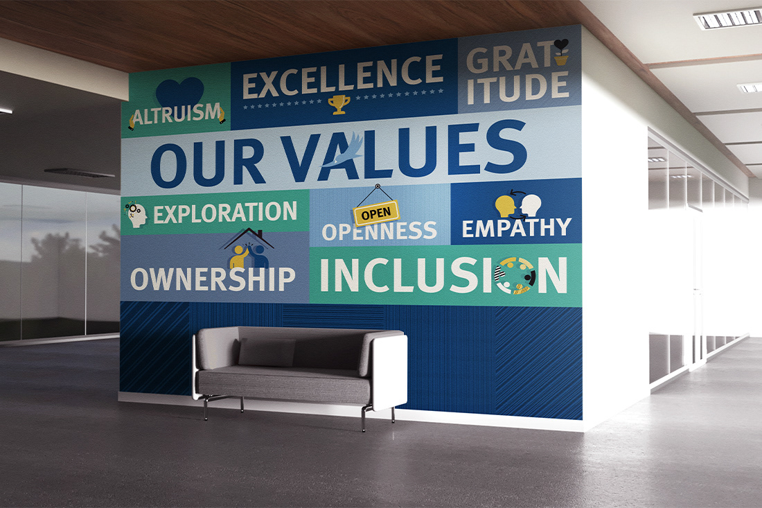
Purpose: To brand out the Falkon workspace to reinforce the company's identity and culture, fostering a sense of belonging and pride among employees. Also, it was the goal to boost employee morale and productivity by creating an inspiring and motivating environment.
Concept: Boldly featuring Falkon's core values in rectangular shapes as the building blocks of the company's success.
Tactics: Mural and posters
Concept: Boldly featuring Falkon's core values in rectangular shapes as the building blocks of the company's success.
Tactics: Mural and posters
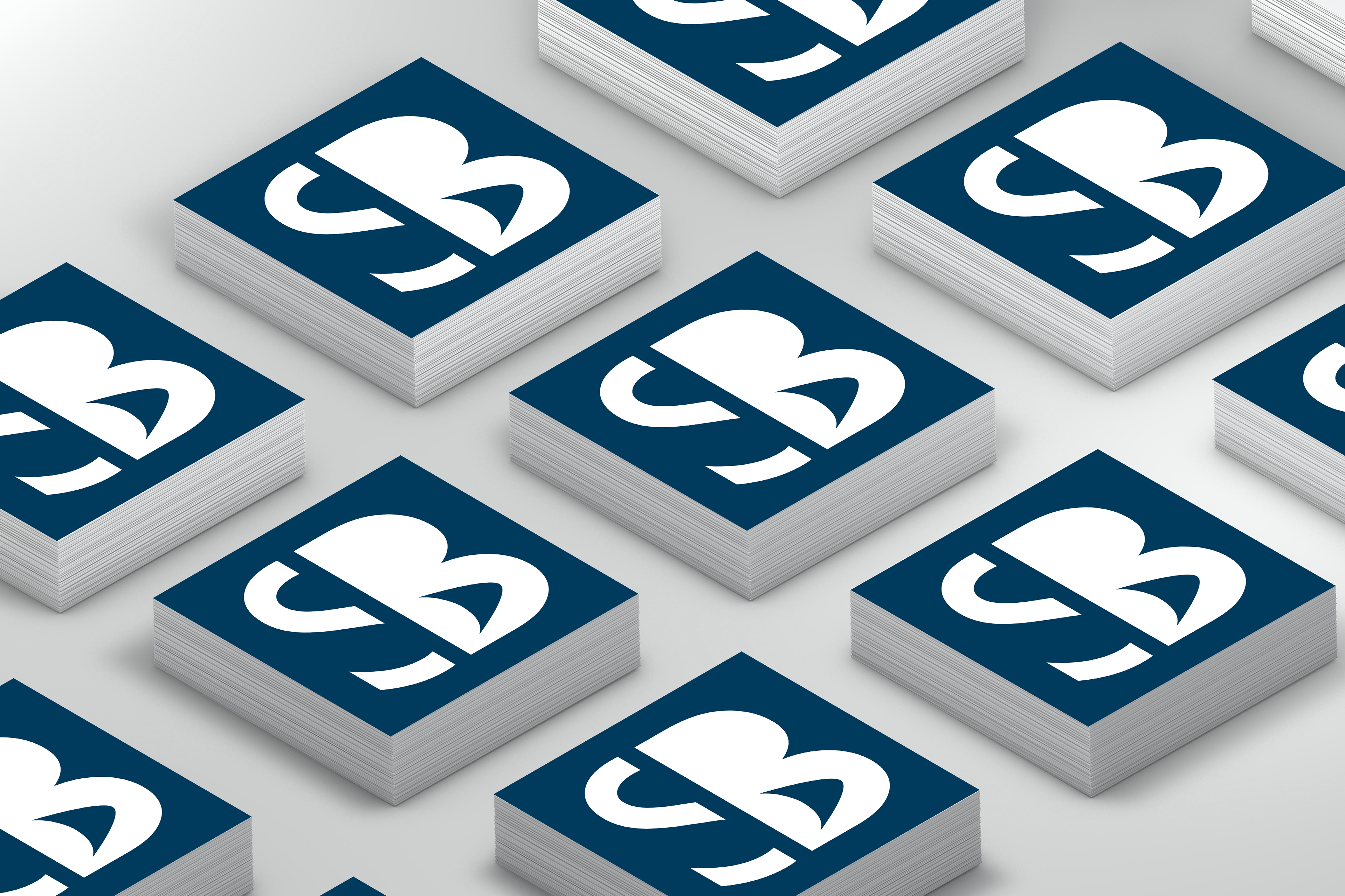
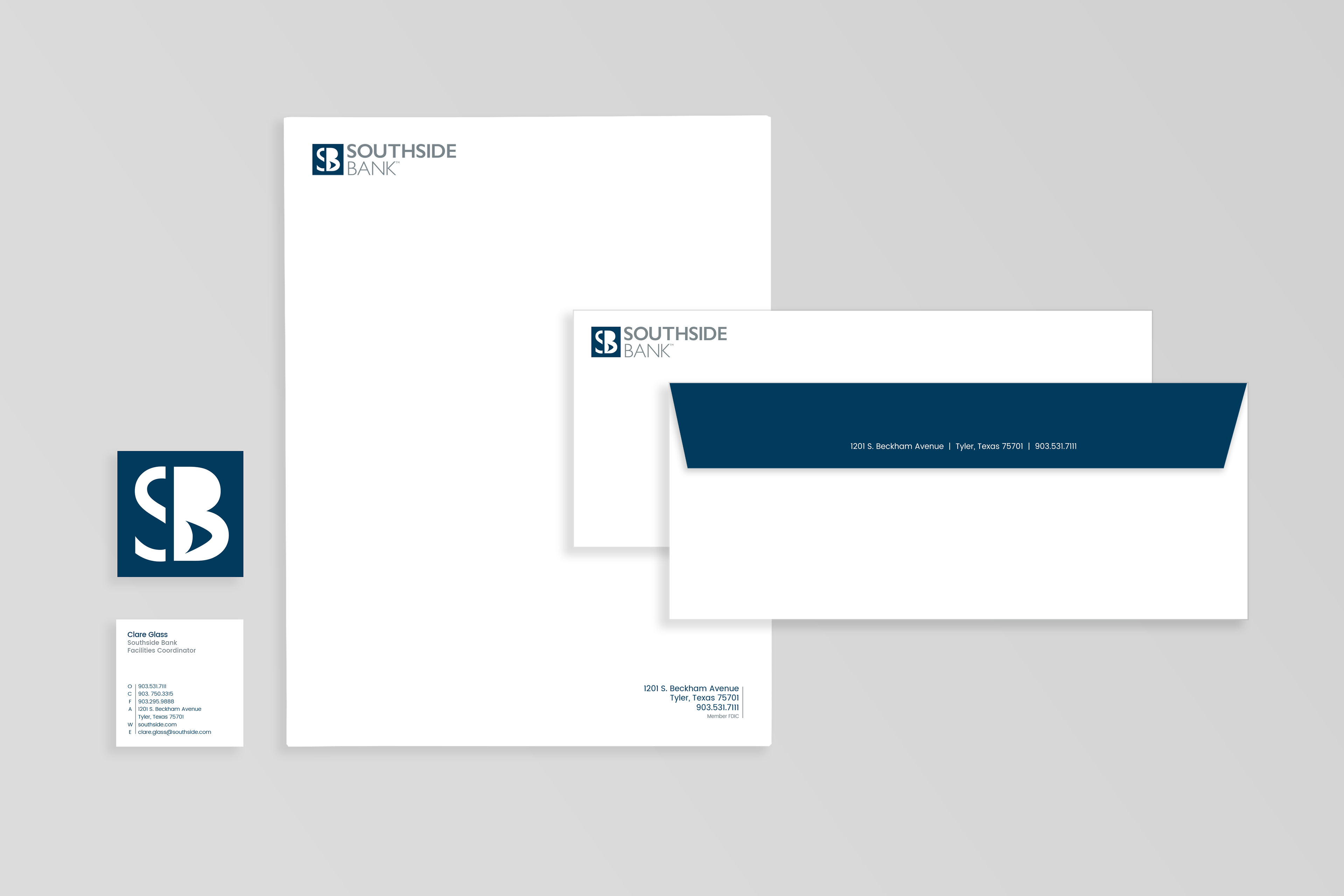
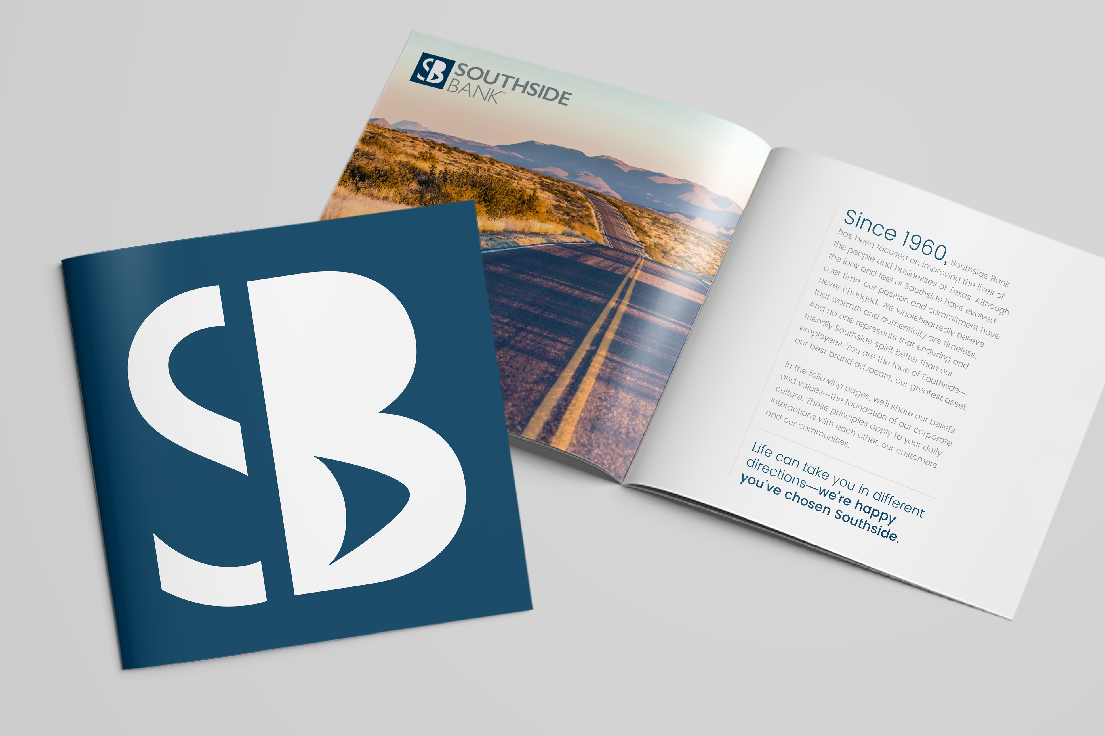
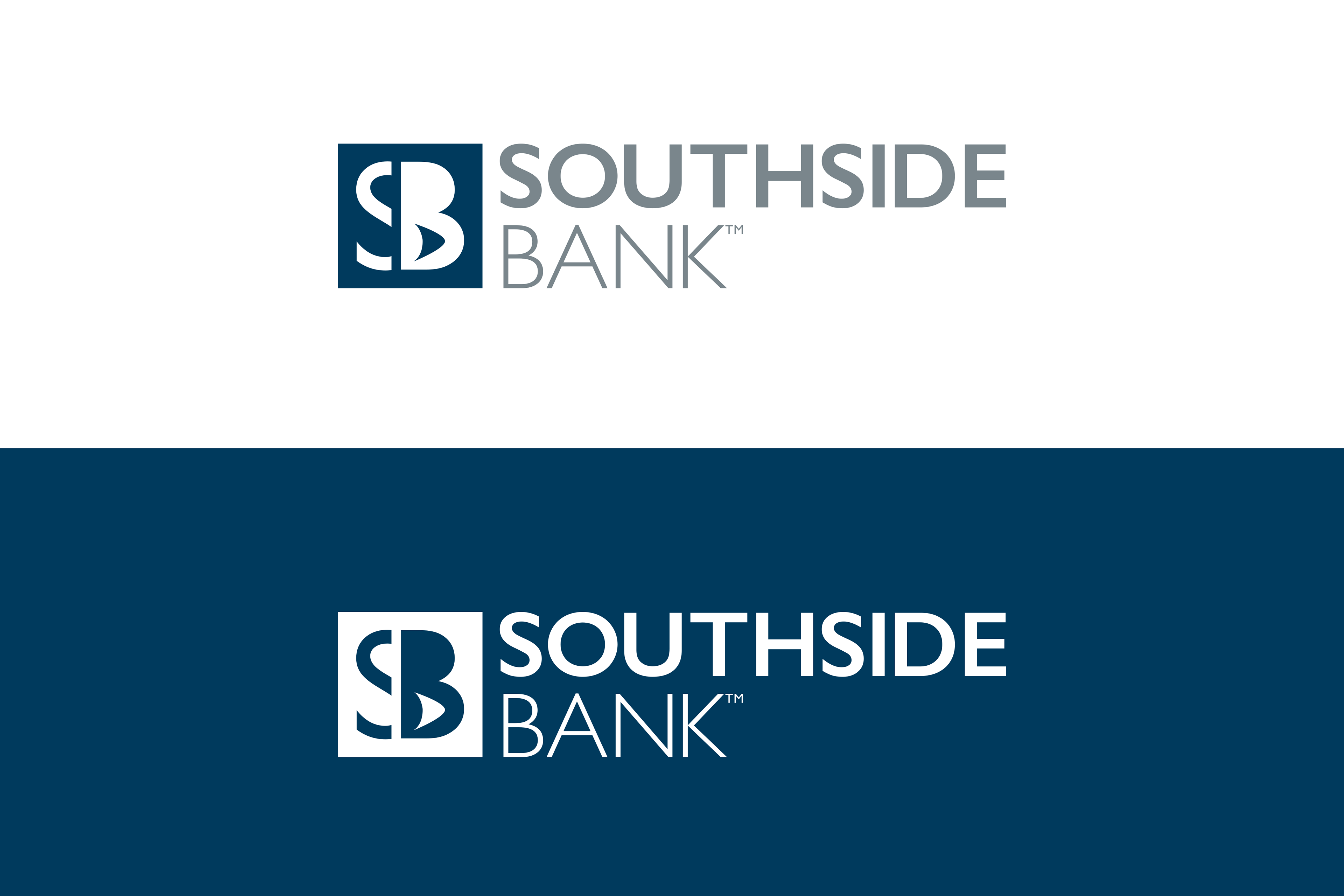
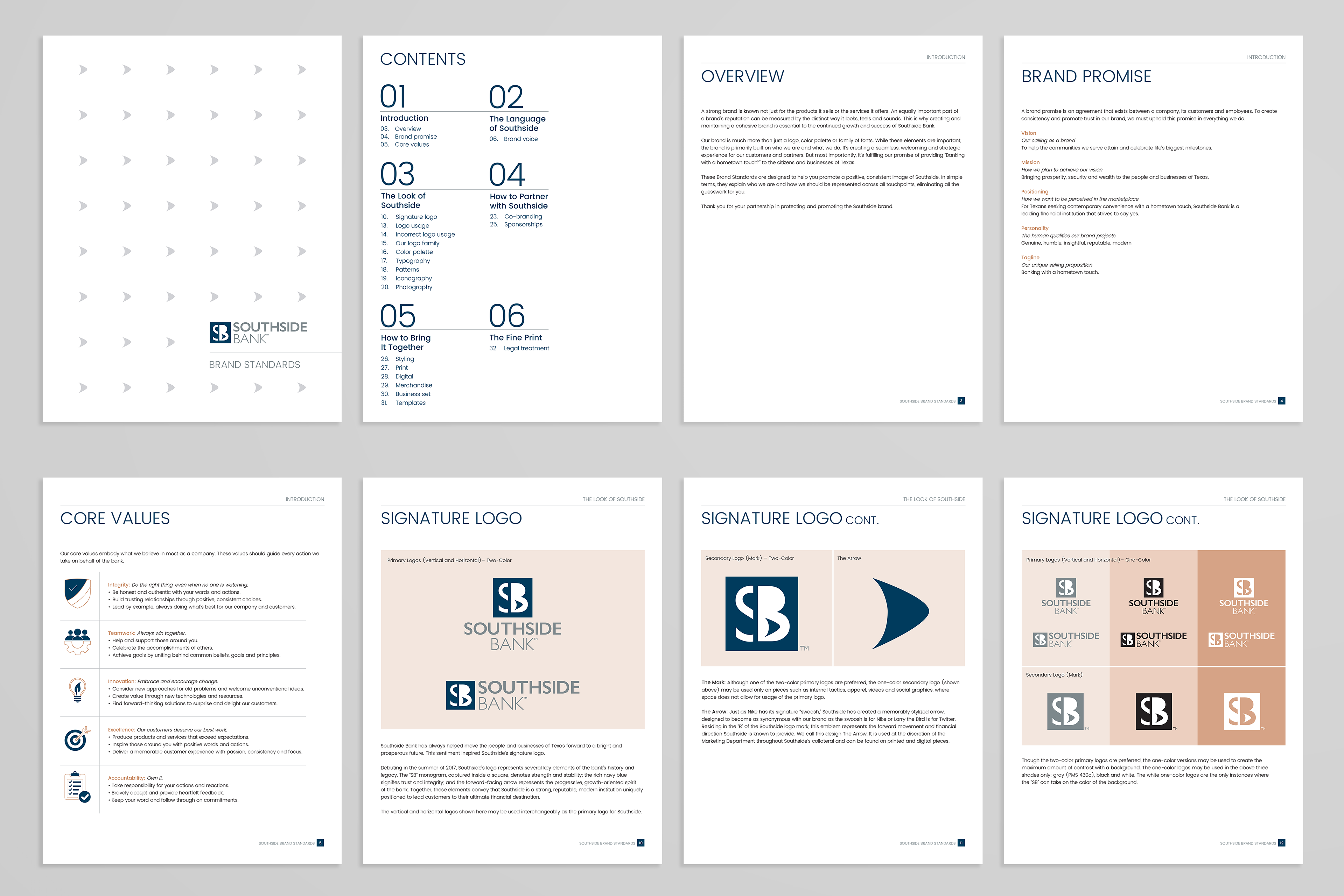
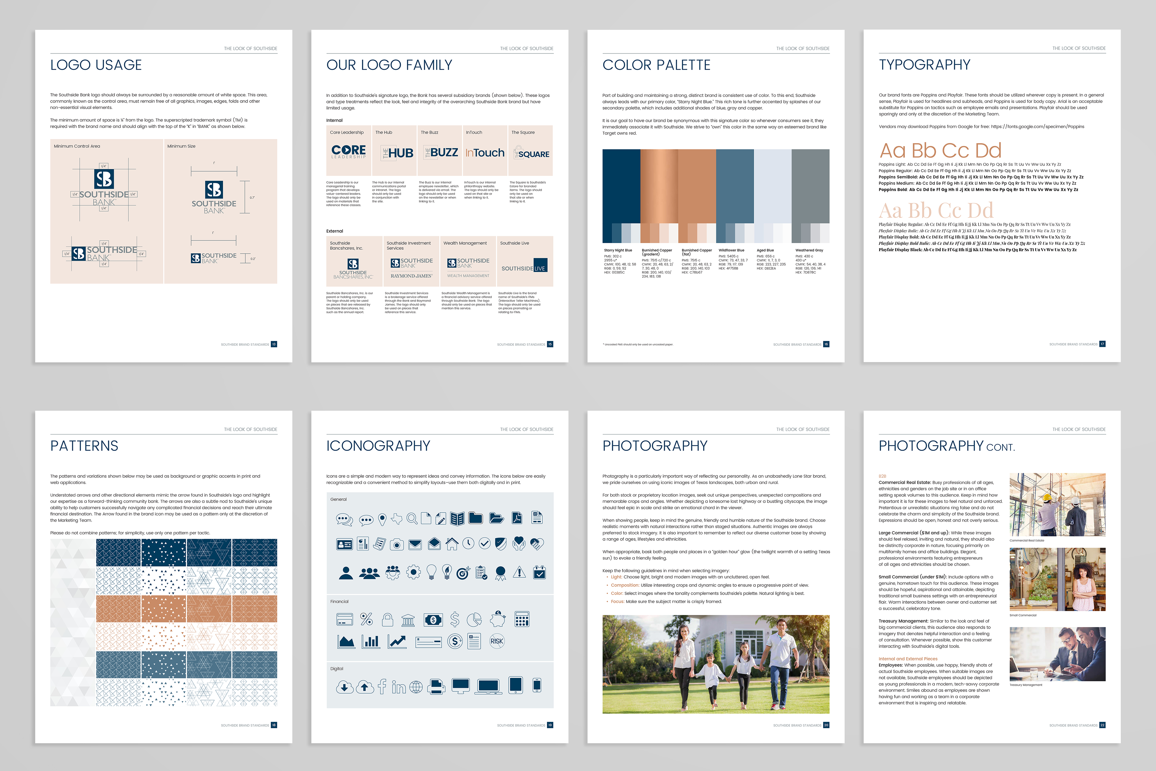
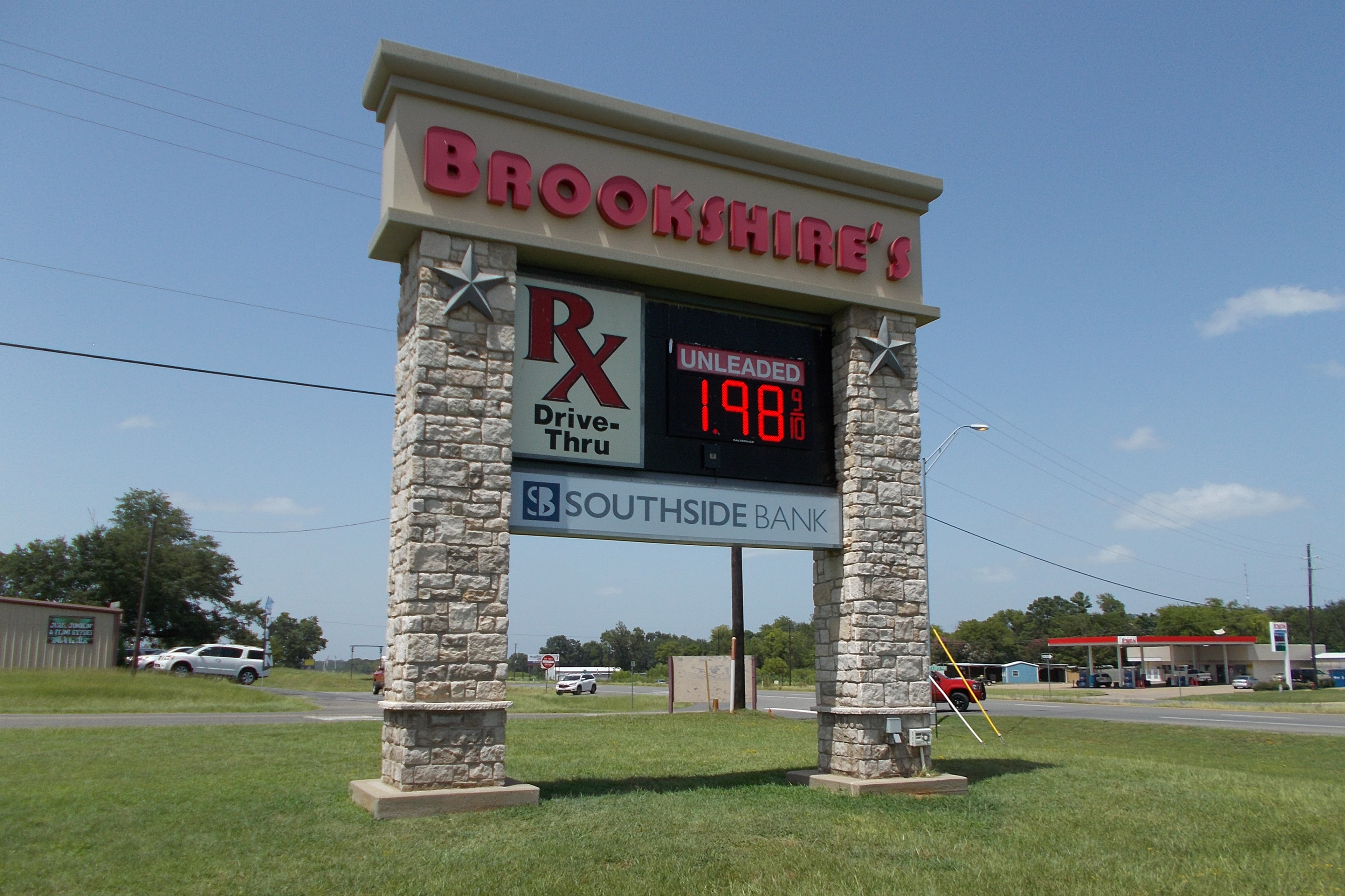
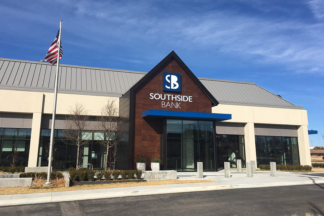
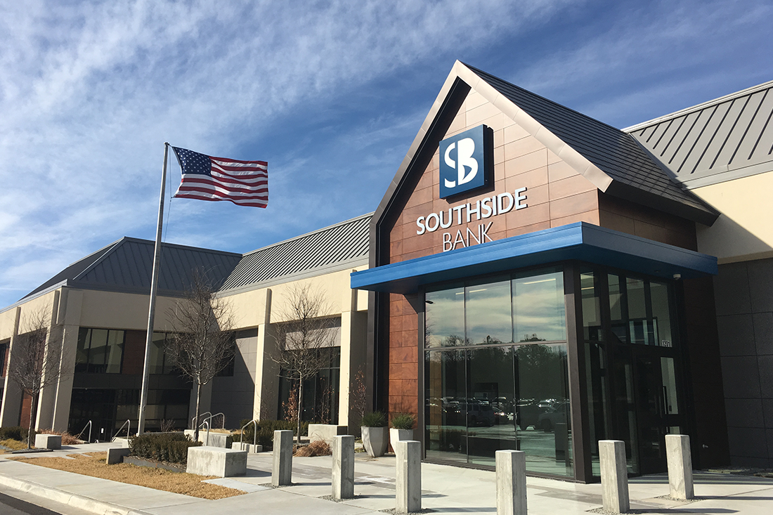
SOUTHSIDE BANK
Rebrand
Ideation | Design | Art Direction | Layout
Rebrand
Ideation | Design | Art Direction | Layout
Purpose: To formulate the brand identity, overall artistic style, and creative image and influence all visual communications. Execute solutions that consistently and clearly communicate the company's positioning & messaging through all touch points.
Concept: Positioning Southside as a modern, friendly, and genuine Texas bank where banking with a hometown touch is an everyday occurrence.
Tactics: Logo, business set, brand standards, UX standards, brand brochure, credit and debit cards, internal recognition items, PowerPoint presentations, flyers, signage, in-store environment, and a refreshed digital experience (website and mobile app).
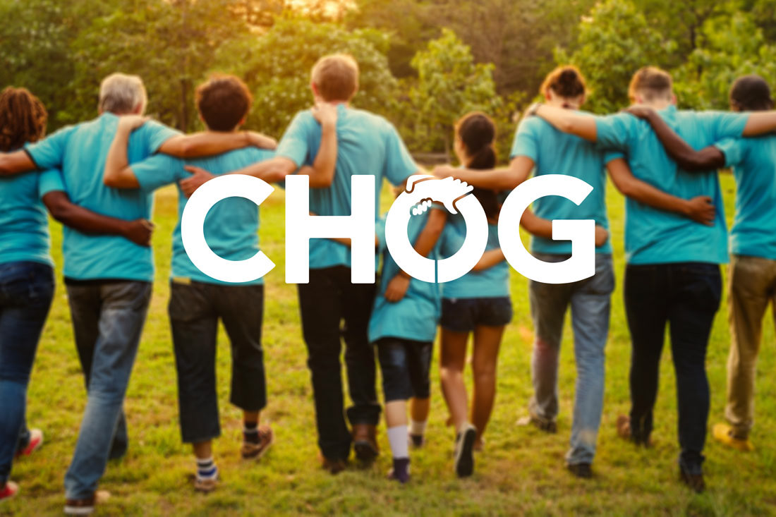
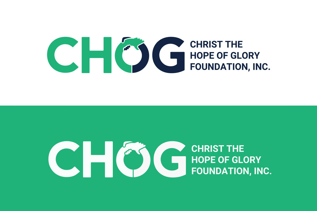
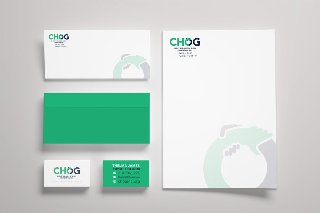
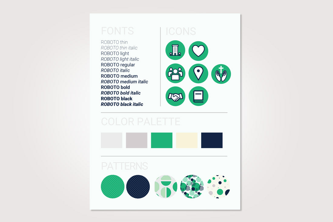
CHRIST THE HOPE OF GLORY FOUNDATION, INC.
Brand Refresh
Ideation | Design | Layout
Brand Refresh
Ideation | Design | Layout
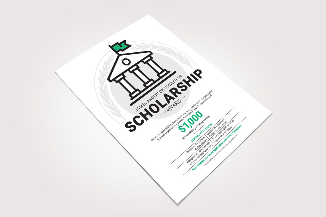
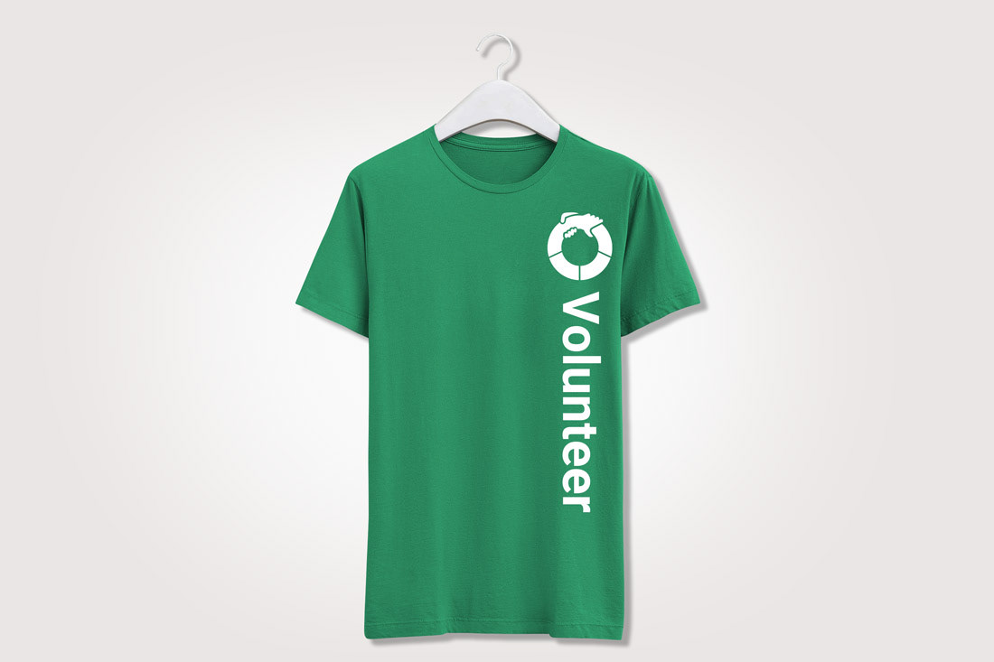
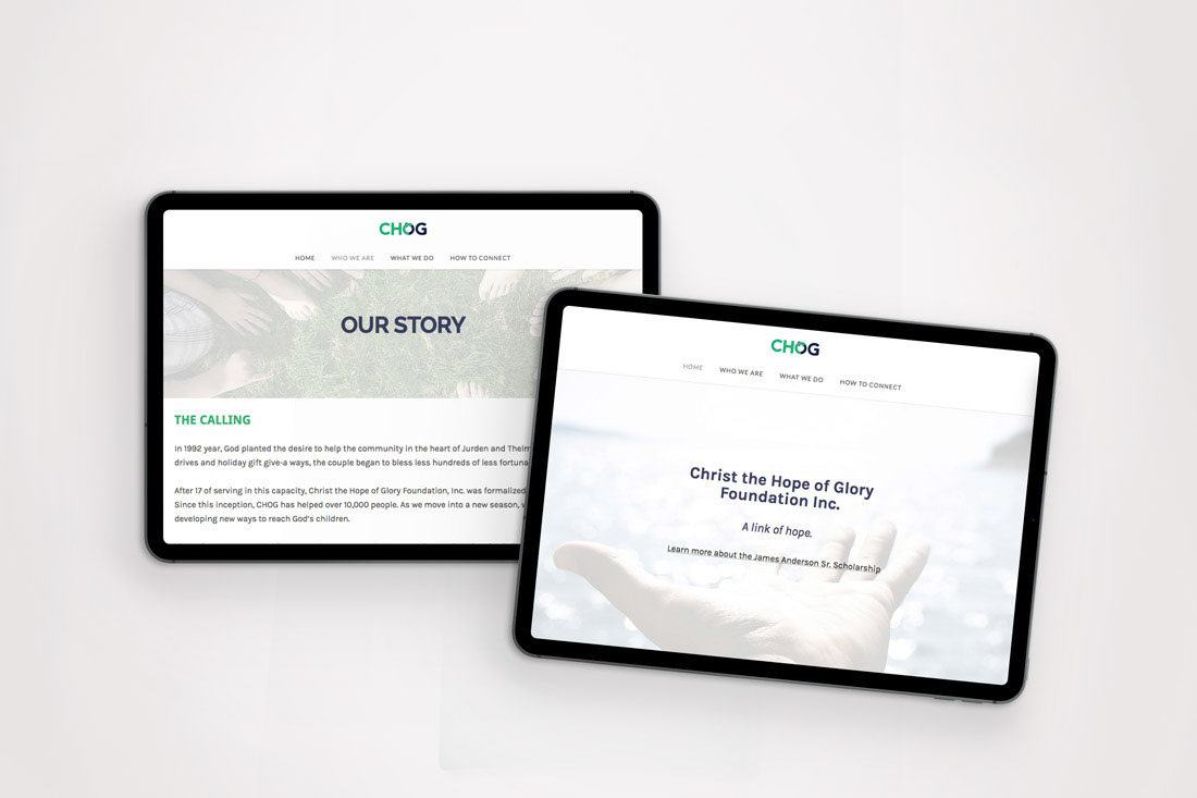
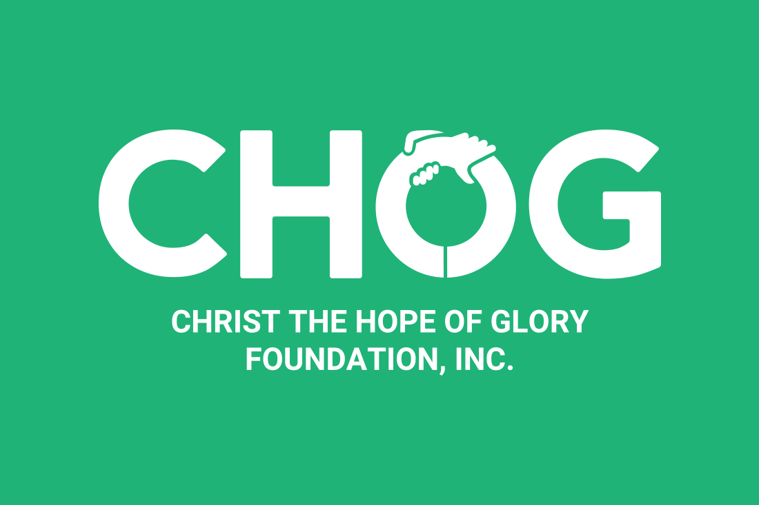
Purpose: To create a fresh new community-oriented brand for a local DFW nonprofit that echoes their core values of hope, respect, integrity, and responsibility.
Concept: The green and navy hand motif was born out of inspiration stemming from CHOG's newly crafted tagline, “A link of hope”. From there, the brand was born.
Tactics: Brand board, logo, business set, flyer, website, and t-shirt.
Concept: The green and navy hand motif was born out of inspiration stemming from CHOG's newly crafted tagline, “A link of hope”. From there, the brand was born.
Tactics: Brand board, logo, business set, flyer, website, and t-shirt.