BLACK PEOPLE WILL SWIM
Spring Swim Session Promotion
Ideation | Design | Layout
Spring Swim Session Promotion
Ideation | Design | Layout
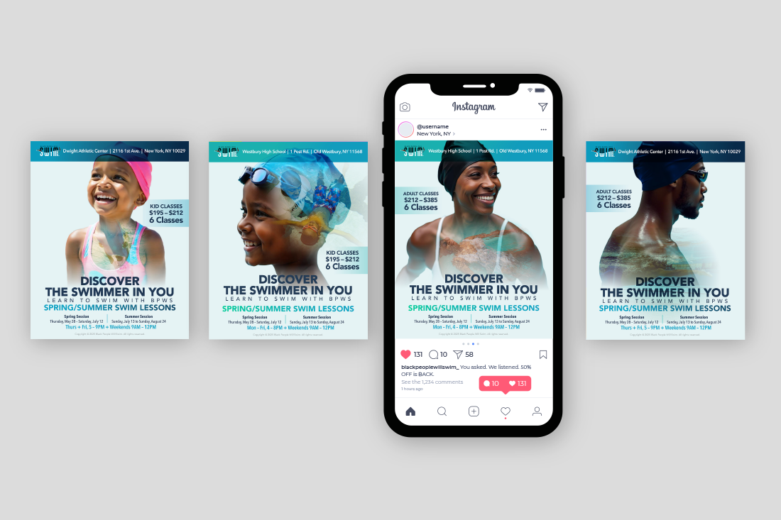
Purpose: To develop a campaign to promote and support the 2025 Spring Swim Lesson Session.
Concept: In the African American community, common misconceptions and stereotypes about swimming persist, often stemming from a fear of water, self-doubt, or lack of access to pools.
Concept: In the African American community, common misconceptions and stereotypes about swimming persist, often stemming from a fear of water, self-doubt, or lack of access to pools.
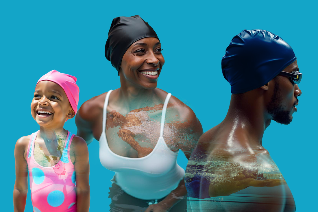
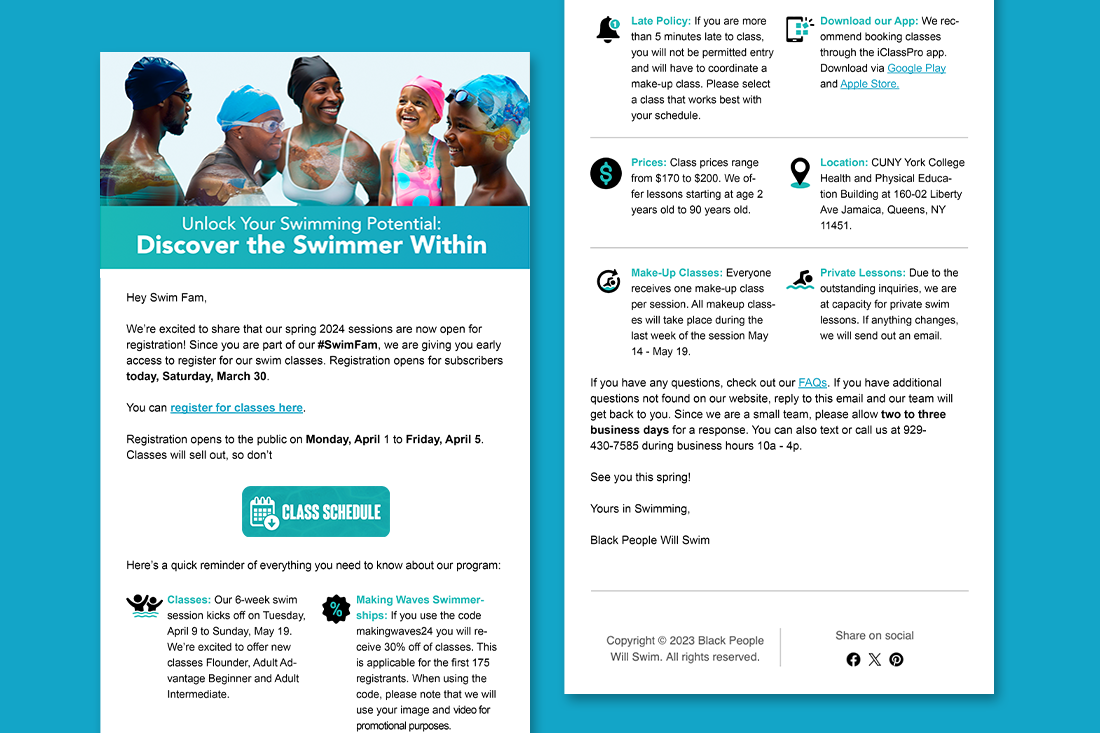
This campaign, "Discover the Swimmer Within," was designed to emotionally capture the journey toward confidence. The concept uses double-exposure imagery, overlaying portraits of confident Black swimmers onto delightful swimmers ready to learn. This visual approach powerfully illustrates what it means to overcome doubt and embrace the swimmer you can become.
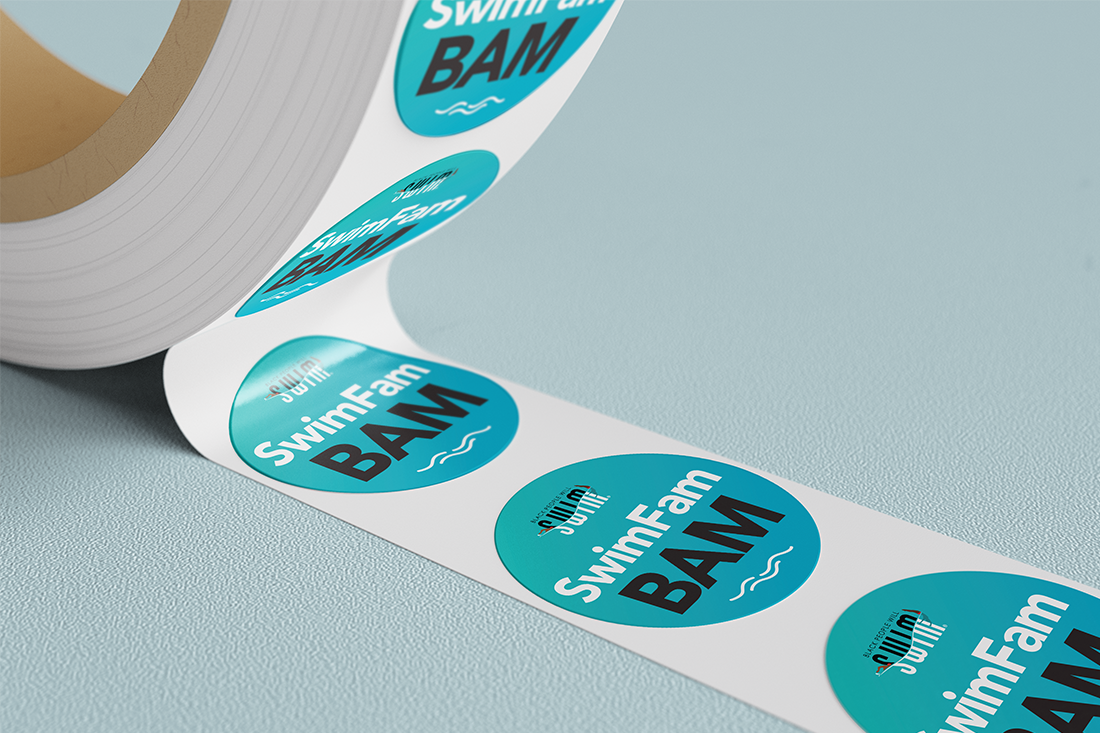
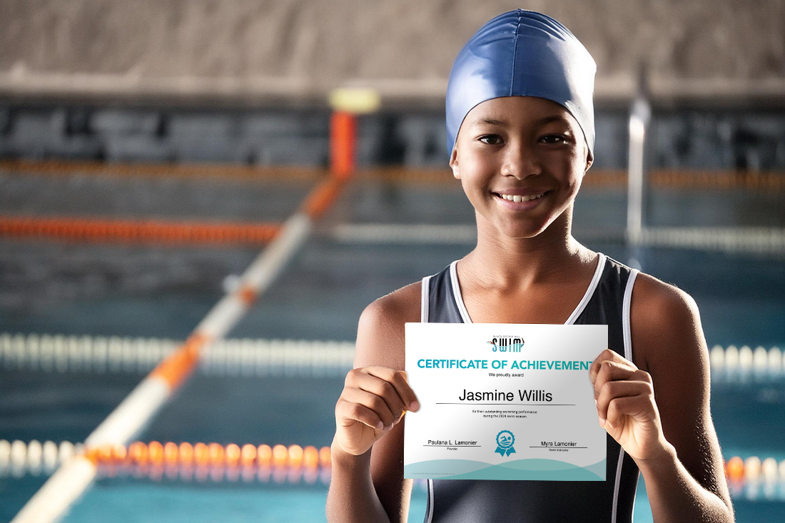
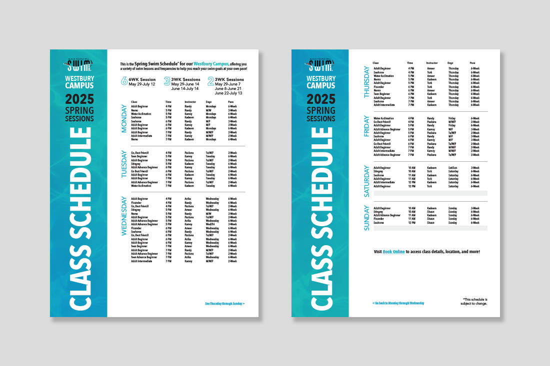
Tactics: Social graphics, emails, class schedule (print/digital), stickers, and end-of-session certificates
Tactics: Social graphics, emails, class schedule (print/digital), stickers, and end-of-session certificates
SOUTHSIDE BANK
Post Rebrand Campaign
Ideation | Design | Layout
Post Rebrand Campaign
Ideation | Design | Layout
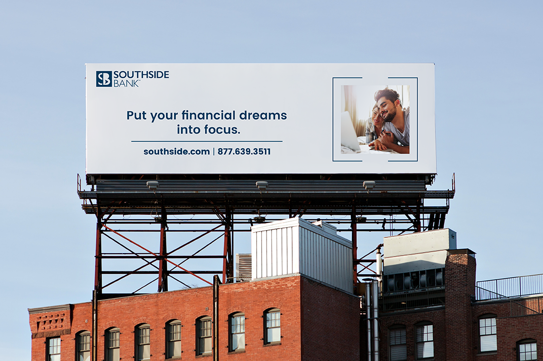
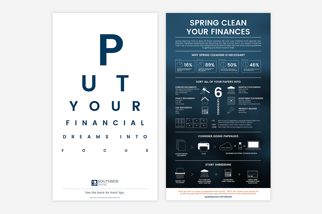
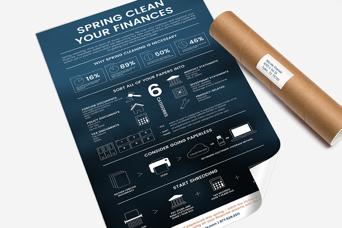
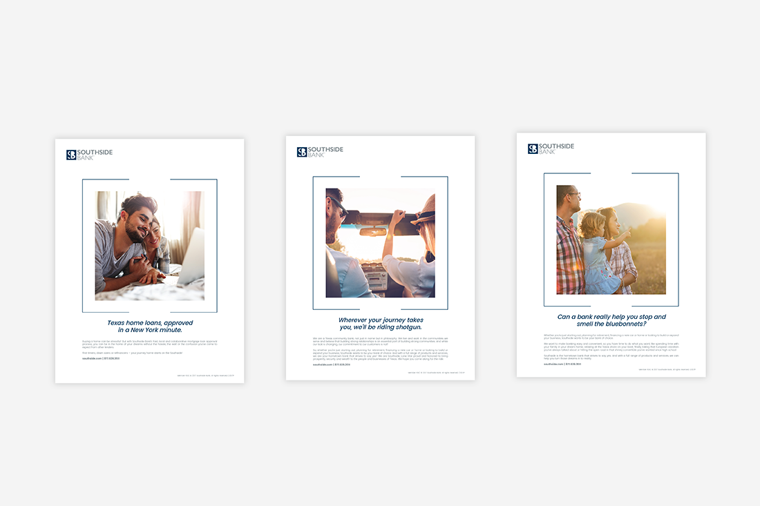
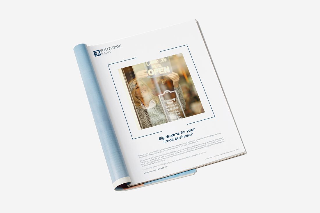
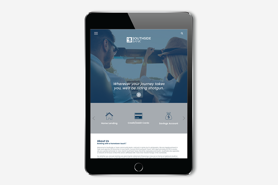
Purpose: To develop a campaign to showcase the newly rebranded bank to its core audience and market.
Concept: Leaning into the "Focus" aspect of the campaign, I experimented with all things sight including images with a shallow depth of field, the optometrist sight chart, and brackets keying in our customer's wants and needs.
Tactics: Billboard, poster, print ad, and landing page.
Concept: Leaning into the "Focus" aspect of the campaign, I experimented with all things sight including images with a shallow depth of field, the optometrist sight chart, and brackets keying in our customer's wants and needs.
Tactics: Billboard, poster, print ad, and landing page.
NERIUM INTERNATIONAL
Preferred Customer Project
Ideation | Design | Layout
Preferred Customer Project
Ideation | Design | Layout
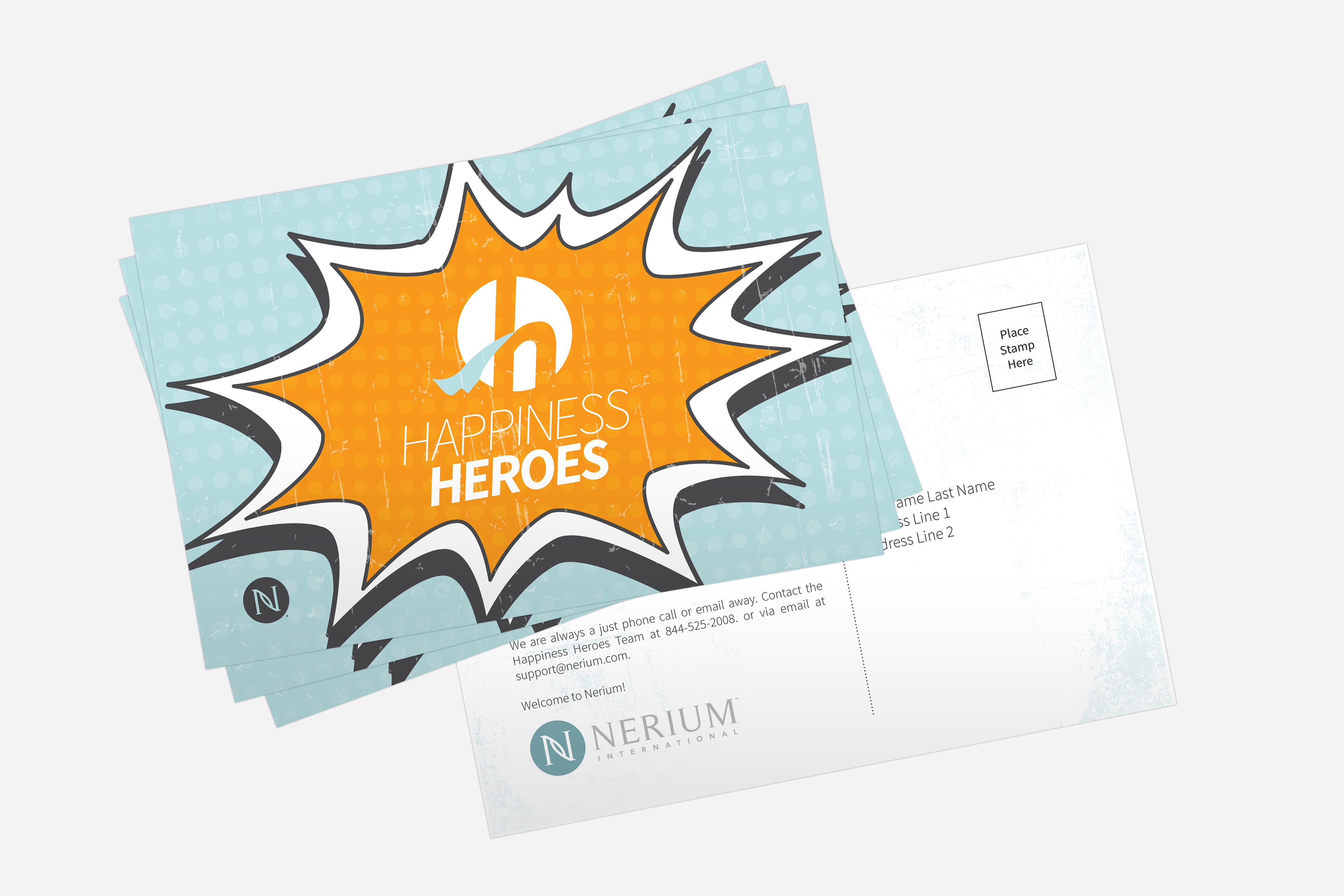
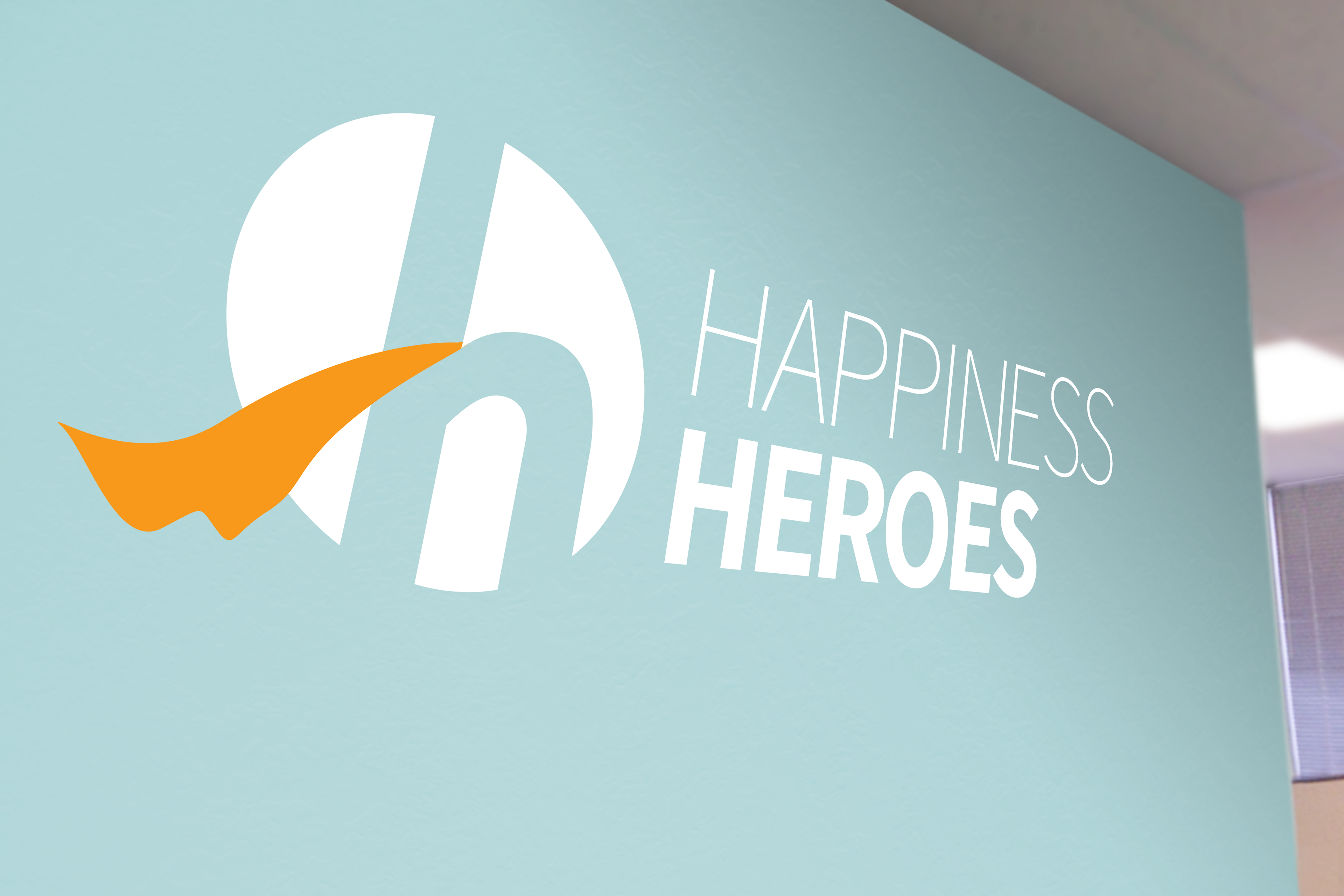
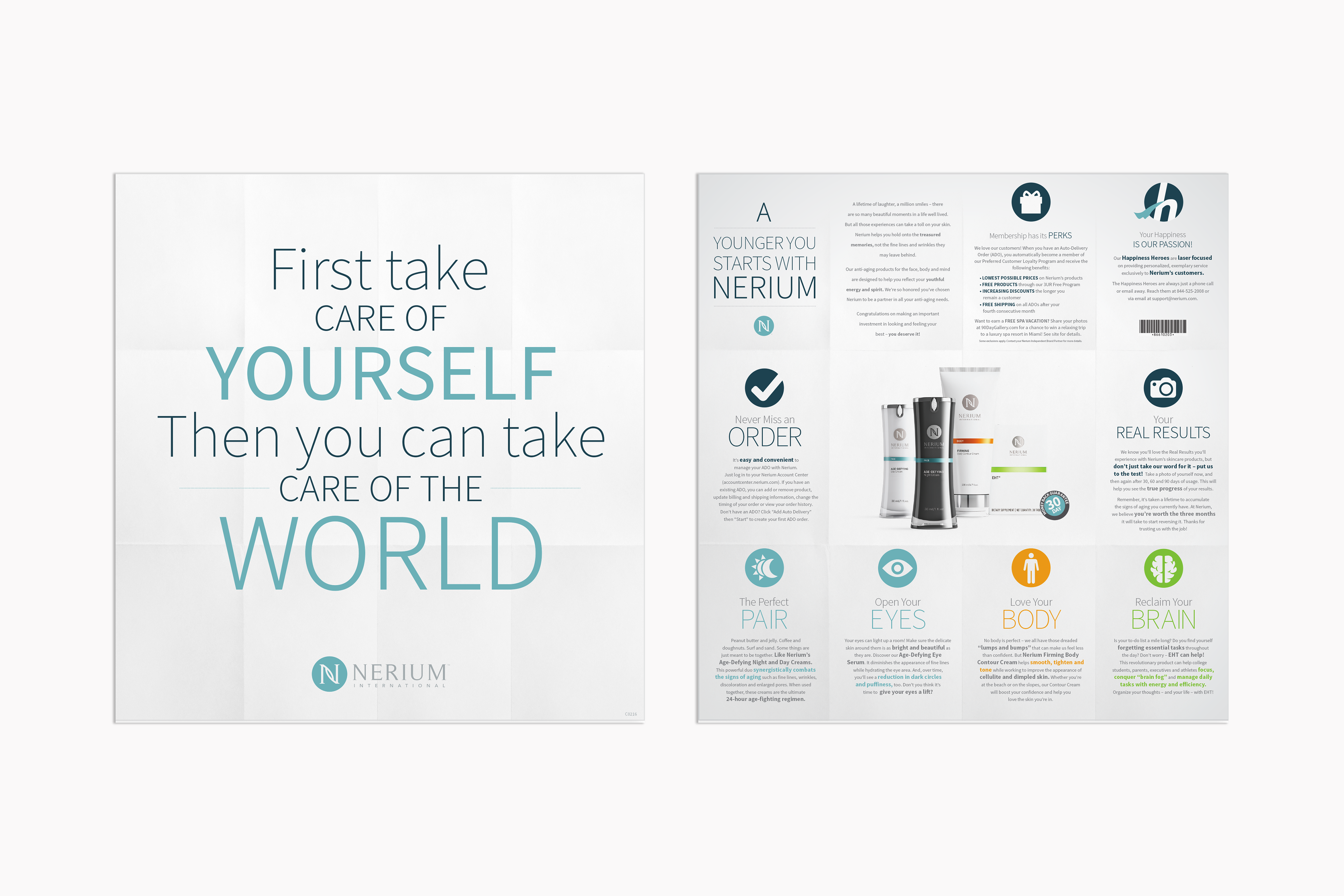
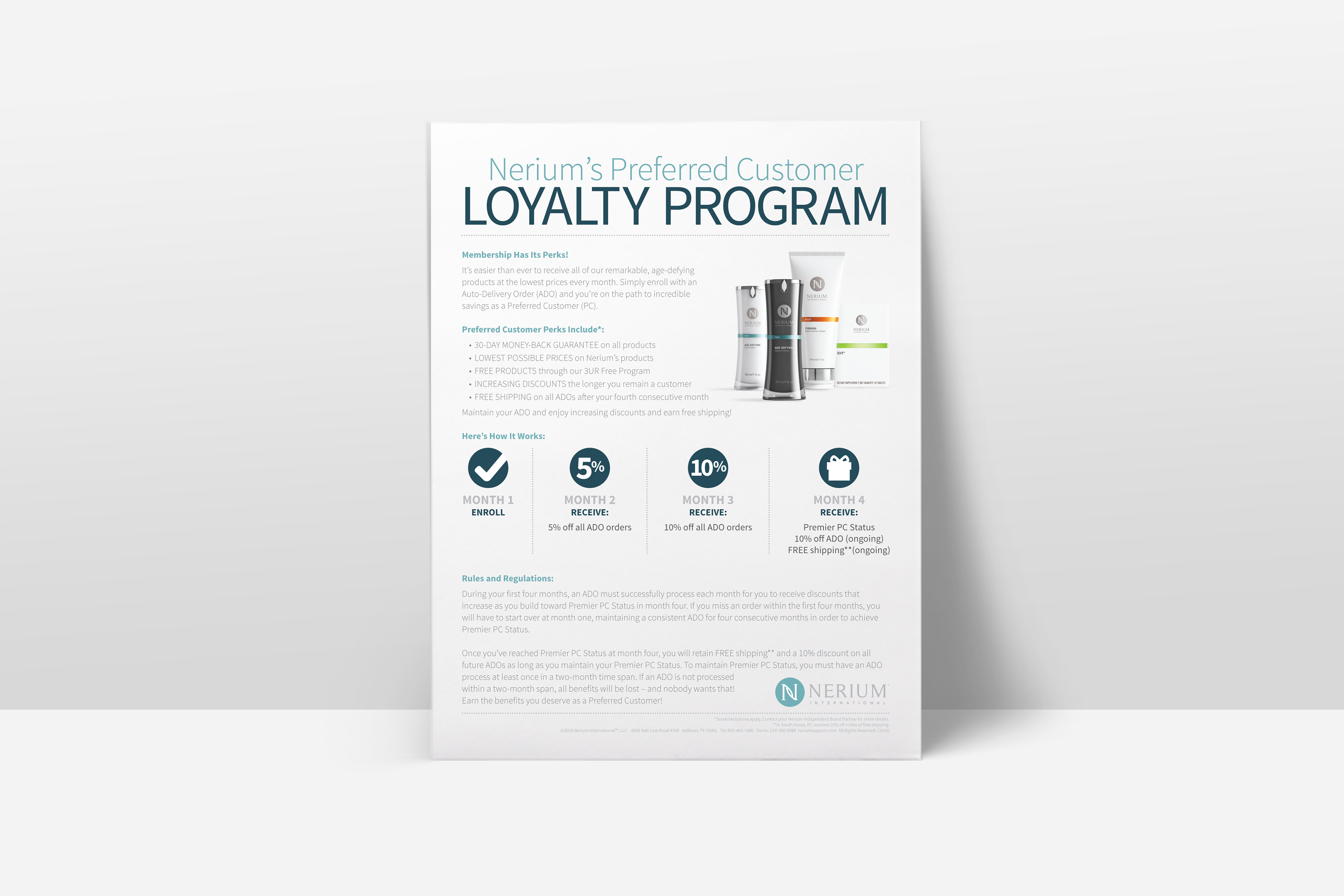
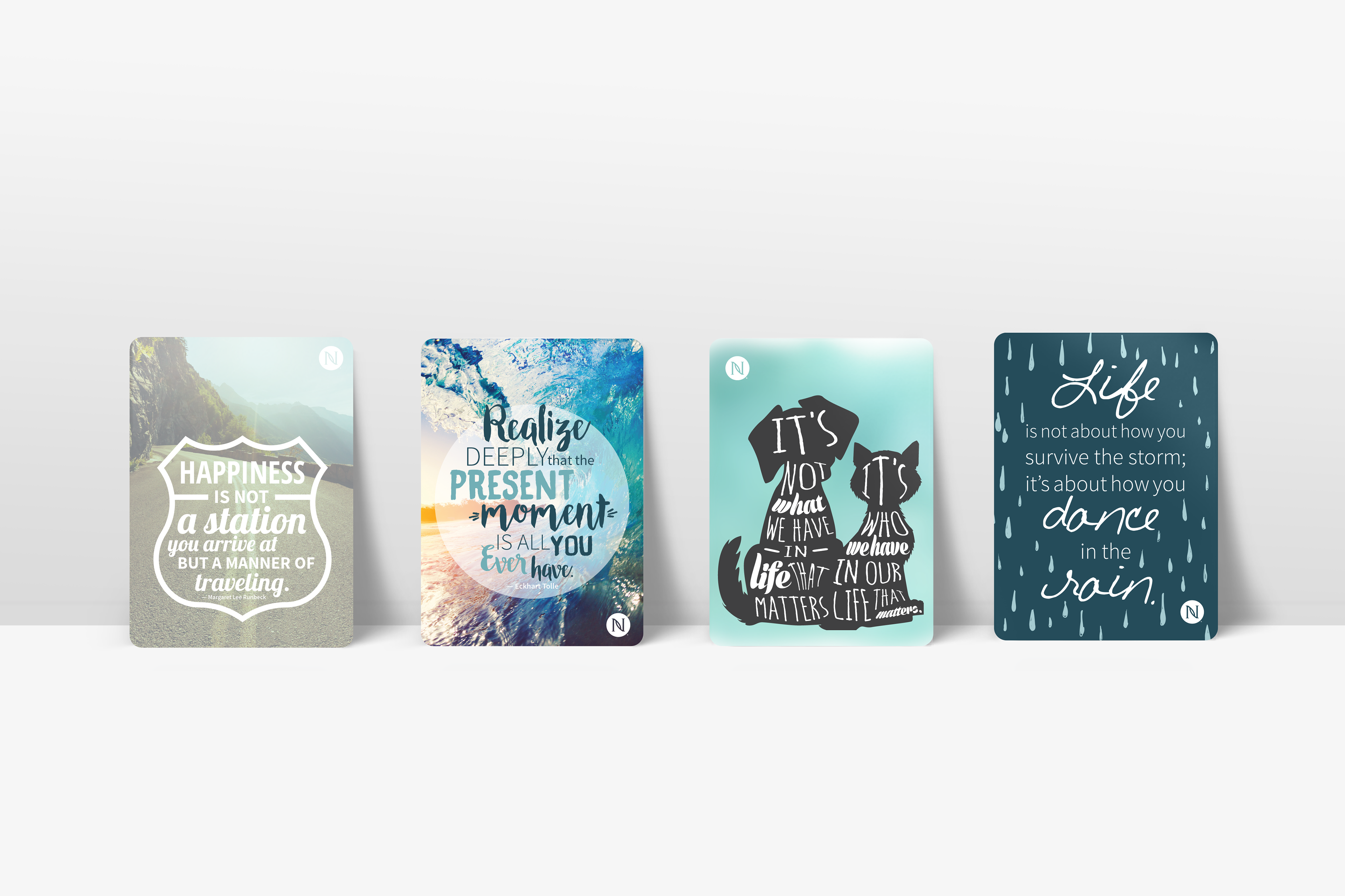
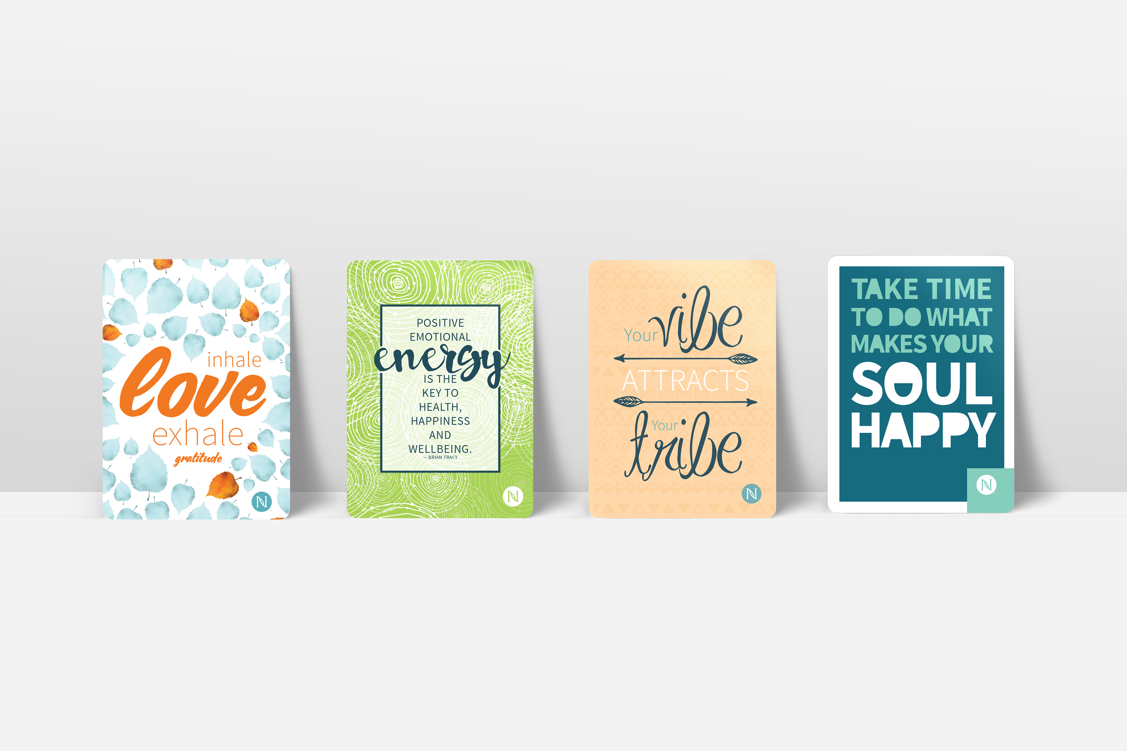
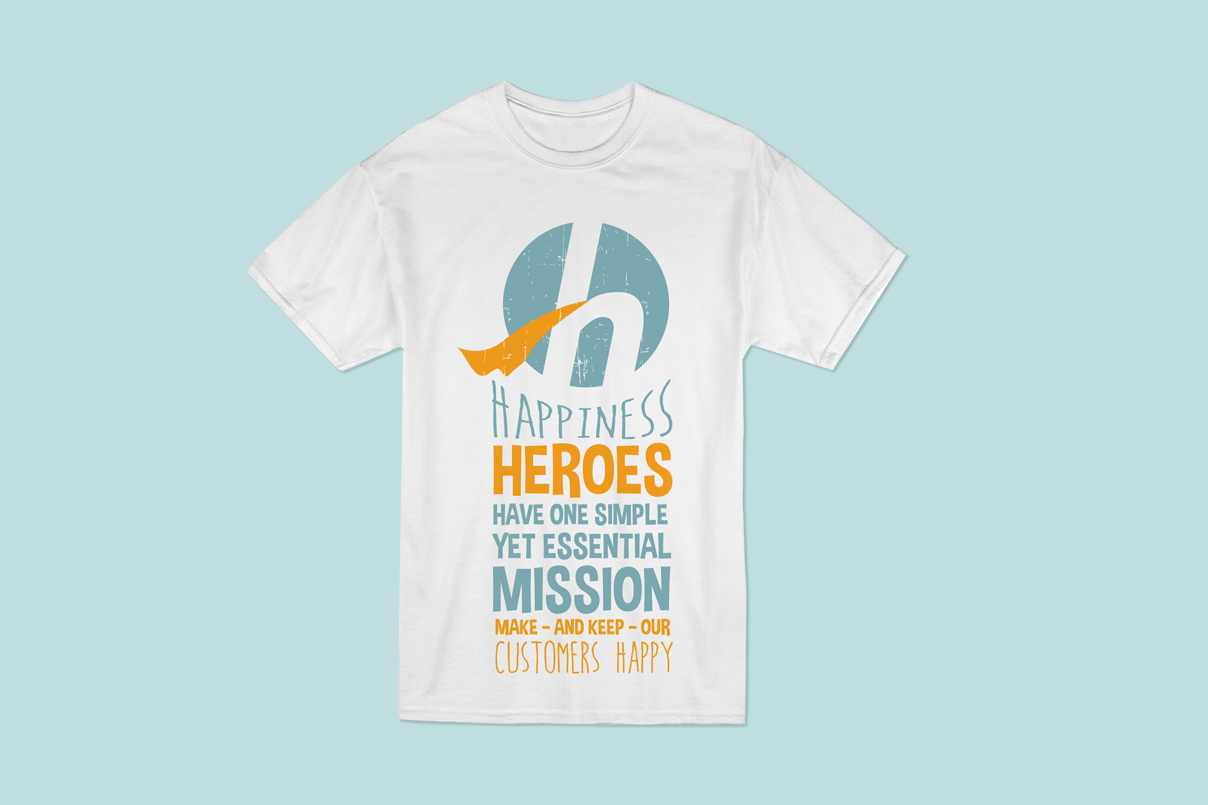
Purpose: To develop a brand around the exclusive Preferred Customer (PC) "Happiness Heroes" team, which is laser-focused on providing personalized, exemplary customer service and to produce the external marketing collateral to keep customers engaged monthly. This project is a part of the company-wide PC retention initiative.
Concept: As a result of the name and purpose of this group, a vintage superhero brand was crafted to support their daily mission, which is to keep customers happy.
Tactics: Logo/brand identity (style, type, patterns, and colors), postcard, email signature, wall clings, t-shirt, welcome brochure, loyalty flyer, and ADO package insert.
CALIBER HOME LOANS, INC.
Retail Jumbo Product Partnership Campaign
Ideation | Design | Layout
Retail Jumbo Product Partnership Campaign
Ideation | Design | Layout
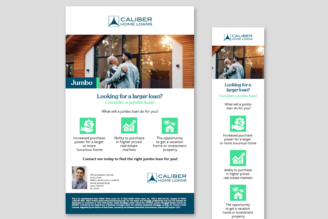
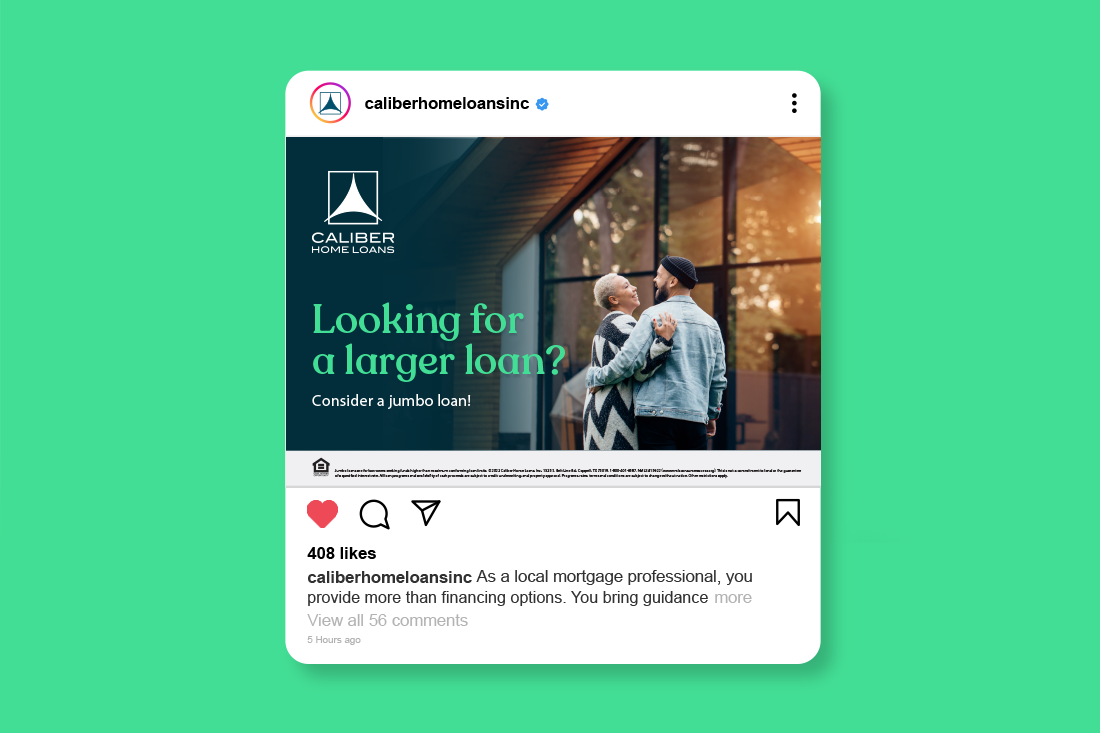
Purpose: To develop a campaign targeting prospective buyers who are looking to upgrade their lives.
Concept: The look and feel of this omni-channel campaign was designed to create an emotional connection. The goal was to sell the feeling of a lifestyle shift—the luxury and comfort a new home could bring—rather than just the features of the loan itself.
Tactics: Email, social media ad, video, and flyer.
